on
Blog Post 1
Geographic and temporal trends in midterm elections?
In this weekly blog series, I will be analyzing and predicting the 2022 midterms as we approach the November election. This first blog post will be exploring trends in elections by looking at the congressional elections in the State of Michigan to explore a key swingtate, which voted for Trump in 2016 and Biden in 2020. I also will be exploring some of the recent trends of popular voteshare by state and congressional district in recent elections.
Michigan - Swing State!
For the first analysis of this post, we will be looking at my home state of Michigan, which has been a key battleground state in modern electoral politics. The state, which went to President Trump in 2016, is home to two Democratic senators and a Democratic governor, but is still always the center of a competitve statewide race and multiple close Congressional districts.
In the map below, you can see and interact with the Republican voteshare by Congressional district from the most recent 2020 election. As you can see, some of the districts, such as the districts that are home to heavily Democratic areas like Detroit and Ann Arbor (which are labeled with red point and black point respectively) are very safely Democratic. Other districts which are home to the more rural parts of the state, particularly as you head further North, are safely Republican. However, Michigan has multiple, generally suburban, competitive districts which have switched control over recent years. Some of these districts are likely to be competitive again. One thing of note is that Michigan swithced to a nonpartisan redistricting system for the first time after this census, so some of the districts look a little different. However, the trends of which parts of the state are competitive, which parts are safe Republican, and which are safe Democratic are likely to hold true. Additionally, the trends seen in Michigan are likely similar to many parts of the country and suburban areas and how their voters decided to vote with a generally seen unpopular President and “bad” economy contrasted with a key issue of abortion rights being taken away, is likely to be a key part of races in both Michigan and across the country! We may explore some of these geographical trends later, but for now they can be seen in the Michigan congressional map below!
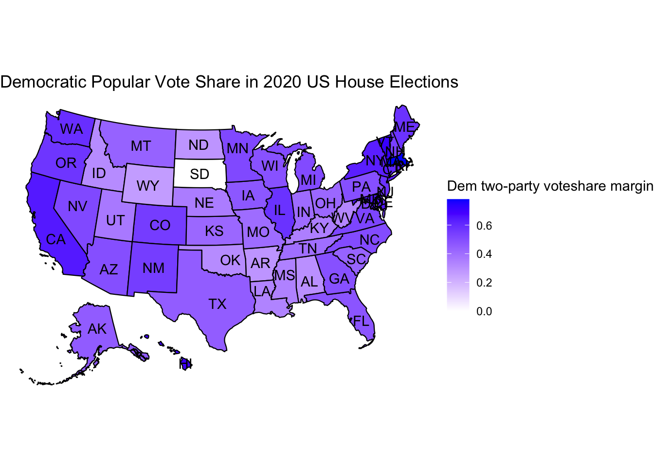
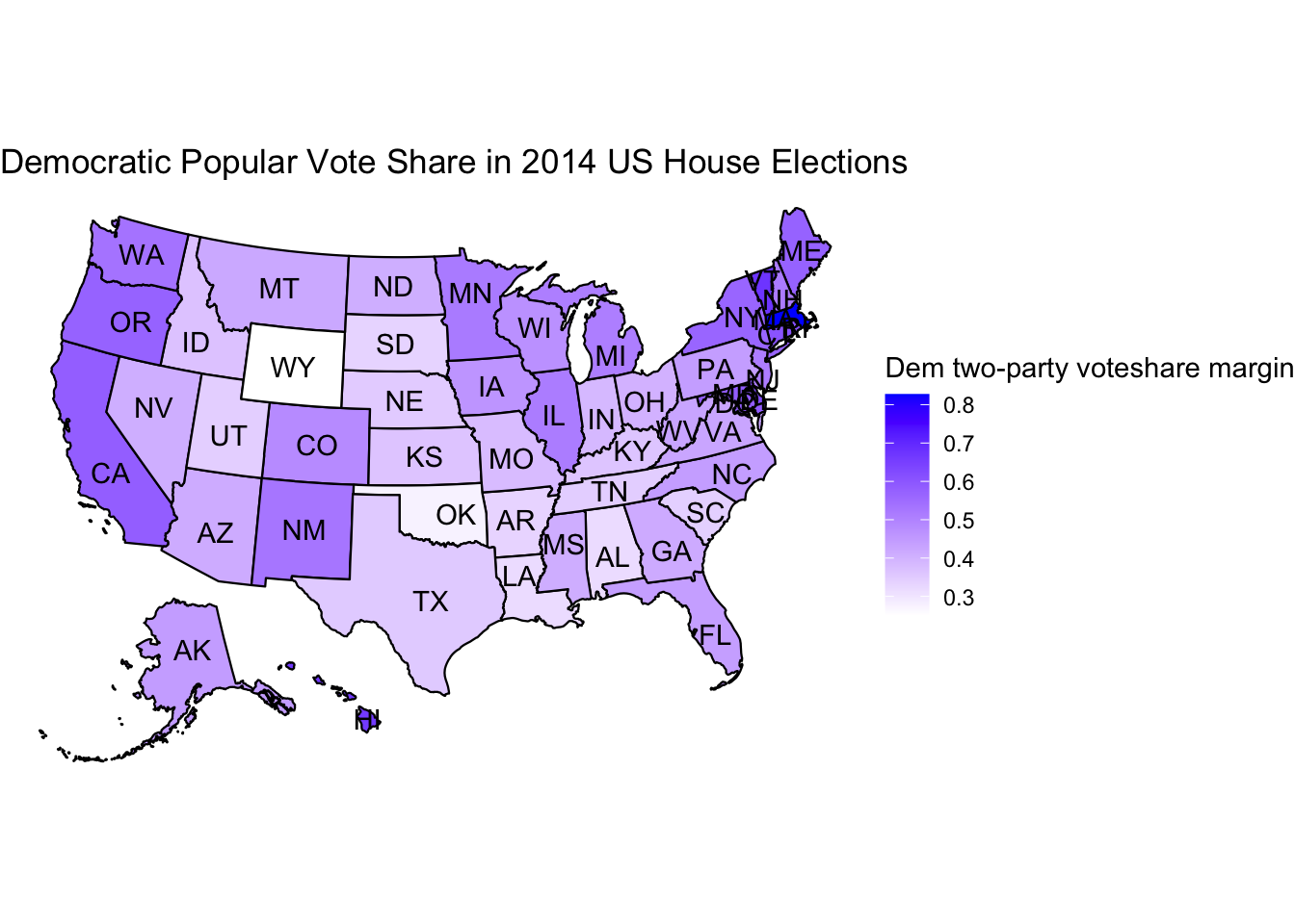
## Exploration of some national maps- Dem popular vote share
Next, we will be looking at maps of Democratic popular vote share by state from 2014 to 2020. The thing that should immediately stand out is that in the 2020 popular vote map, the Democratic vote share appears a lot darker in numerous states, indicating a higher Democratic vote share. This is not just in important swing states like Michigan or Pennsylvania, but also is true in Democratic strongolds like New York and California and also in numerous Republican strongolds in the south like Texas. A large part of this is that the Democrats won the house and the popular vote share in 2020 and lost in 2014. However, we should keep track of the dramatic changes because it partially indicate that Democrats are becoming more competitive in popular vote share in various states. I don’t mean this in terms of seat share, which we should know varies from election to election. However, it may be an interesting consideration as the blog progresses to consider how Democrats have changed their overall popular vote share even if they are not winning as many states just by making more elections competitive and doing better in the elections they win.
## 2014 Republican Vote Share by District - Entire US
Finally, we have included a map with the Republican popular vote share by district - similar to the map of Michigan - but with a map of the entire country. This allows us to look for the trends shown in the last two maps as well as in the first map, but on a national scale by district. This map will be useful for future blogs’ analysis with more information, but for now it is a nice visualization of what congressional districts and their results look like across the country and gives us a level of detail past what statewide voteshare for congressional races gives us.
```